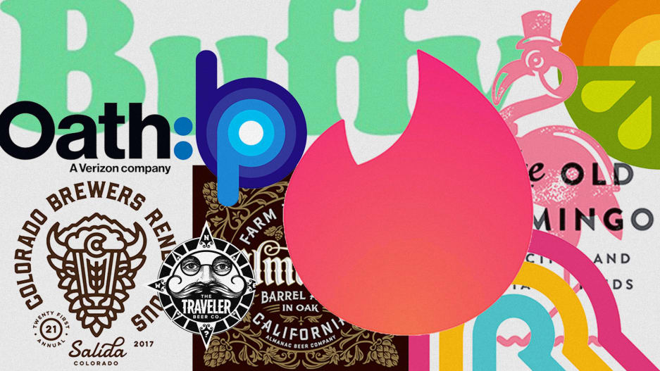
The pendulum is swinging away from clean, modern aesthetics toward curvy, retro designs.
This article cleverly outlines 15 trends of logo design in 2018. Personally, I’m a fan of the “NEO VINTAGE” & “FATTY FADE” styles of logo design.
There’s a thirst for nostalgia and a hearkening to past decades. Designers are dusting off their old font folders and going back to designs that were popular in the 1970s, ’80s, and early ’90s. Letters with big, expressive serifs are an added embellishment that changes the viewer’s perspective, perhaps recalling a different time period, but done in a uniquely new way with modern influences. Millennials are most responsible for bringing these trends back into play, and now you can see the influence everywhere, from the resurgence of tiki bars and speakeasies to retro products like shaving kits for men. By going backwards, you can pick and choose what you want to bring forward, and blend it with contemporary aesthetics. I’ve seen a lot of brands doing this successfully, and I think it’s just the beginning.
View Original Post on Logo Lounge
Which logo trend do you like best? Do you like any of them? Leave a comment below!
Share


Show
151 comments